Artsy: For the Future and For the Past
Art comes in all shapes, sizes, and ages. So do Art lovers.
Can we engage a younger community with the same platform that long-time art experts know and love? Find out how my team and I worked together to create a solution for the leading online art marketplace that will keep them one step ahead.
-
Role: User Experience Designer
Duration: 4 weeks
Skills: Figma, Prototyping, User Research, Group Ideation, Story Telling, Trello, Feature Development, Wireframing
Artsy is unique in its proven ability to bridge the gap between everyday people and artwork, photography, and design from around the globe.
Let’s set the scene -
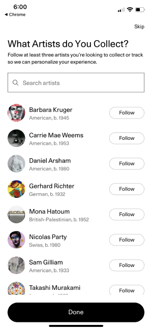
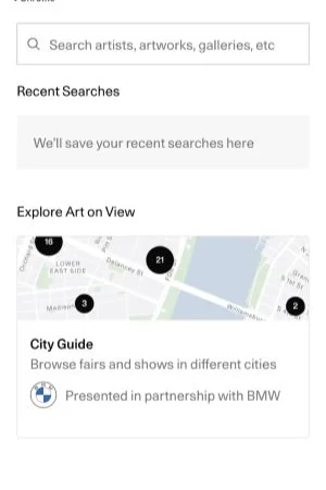
Existing Conditions
(Artsy.net and Artsy mobile app - dated 5/24/22)
Artsy.net - The premier website (and app) to discover, buy, and sell all things art. Together with a team of two fellow UX designers and one UX researcher, we set out with the following prompt;
Redesign the mobile website to evolve alongside a new generation of art enthusiasts allowing them to discover all that Artsy has to offer while staying true to its original colors that current users love so much.
*This was a group study conducted as a part of our experience in the General Assembly UX Design Immersive program and is in no way affiliated with or commissioned by Artsy.net directly
What did we find out
through our extensive user and market research you ask? Well basically…
Art consumers needed a better way to engage with art and artists they like, feel a connection to their local art community, all while finding art within their budgets so that they can successfully purchase pieces they love.
The Solution?
What’s new
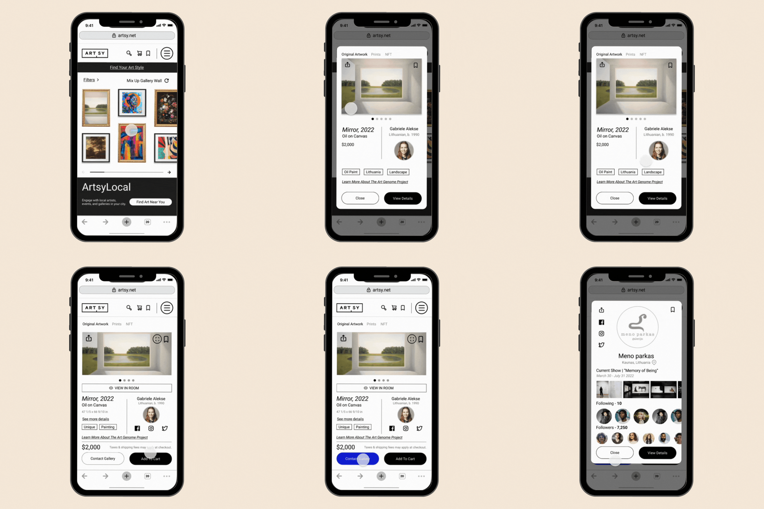
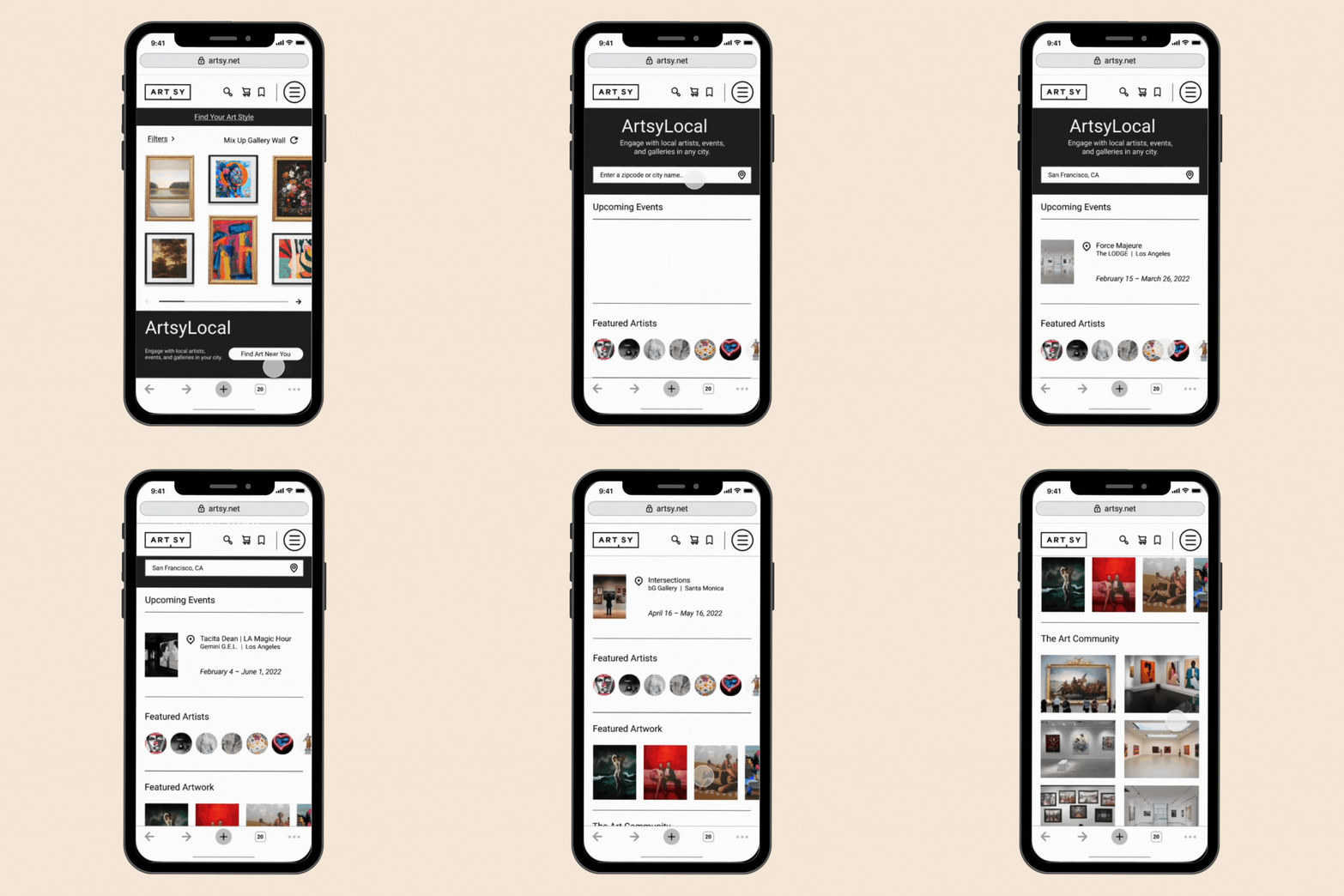
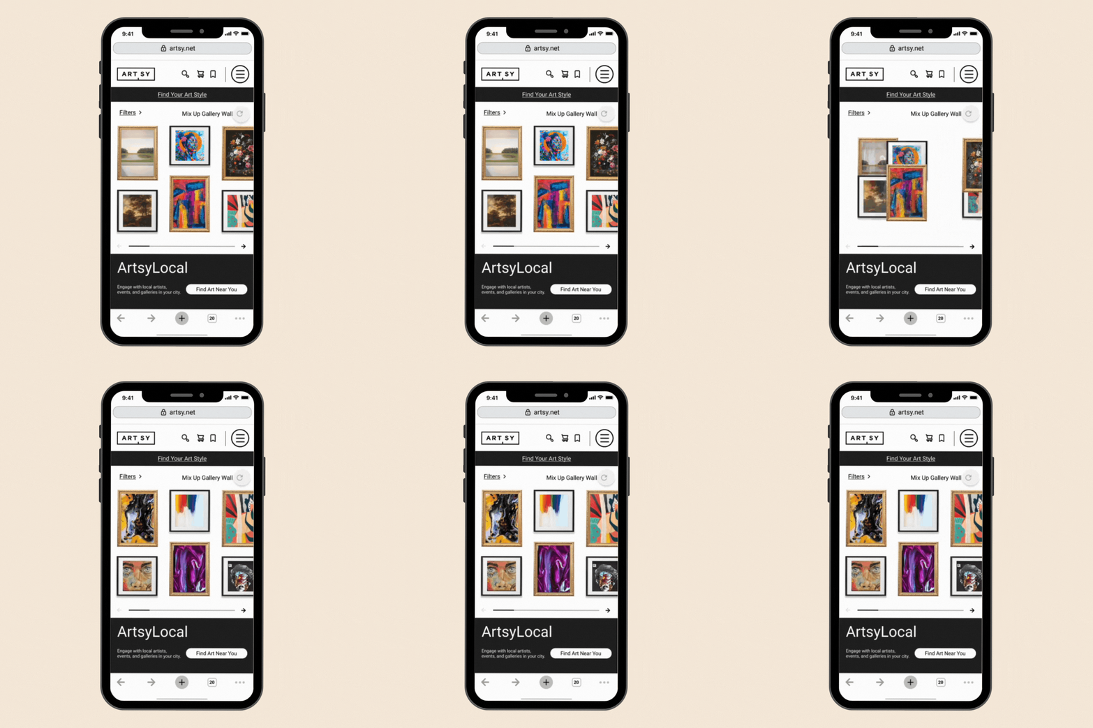
Discover new pieces through the interactive “gallery” wall.
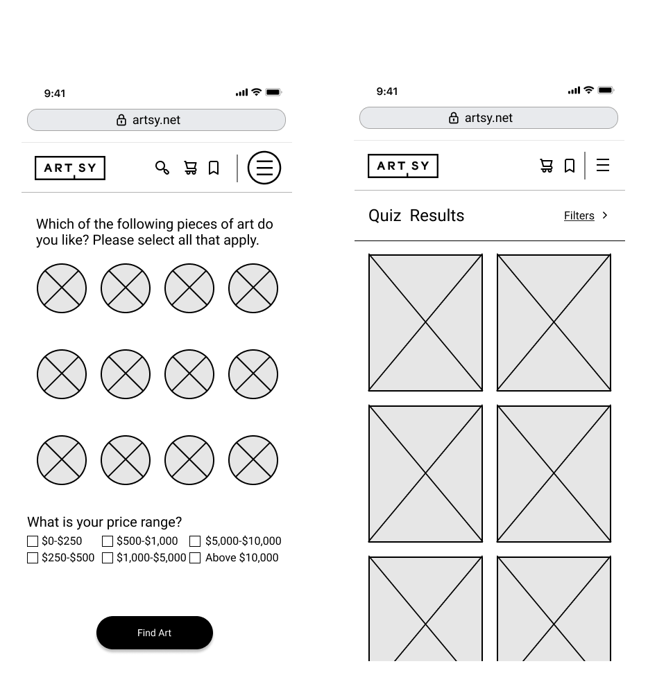
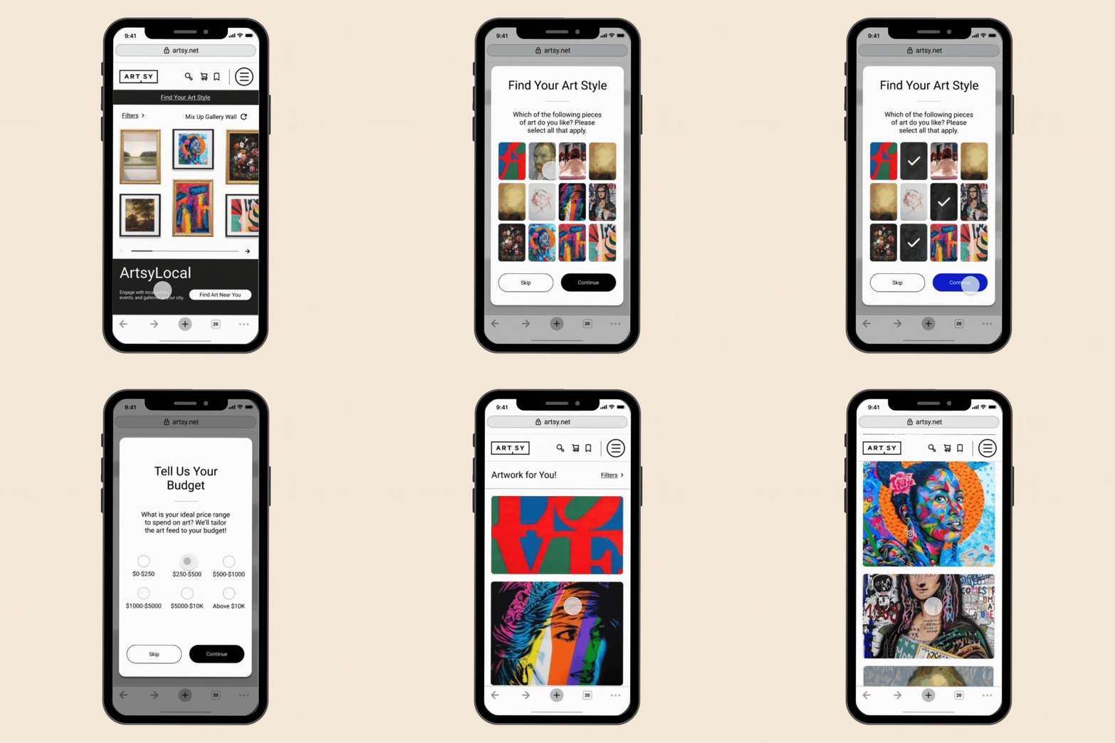
Curate through new filters and a style quiz to find something you love, in your price range.
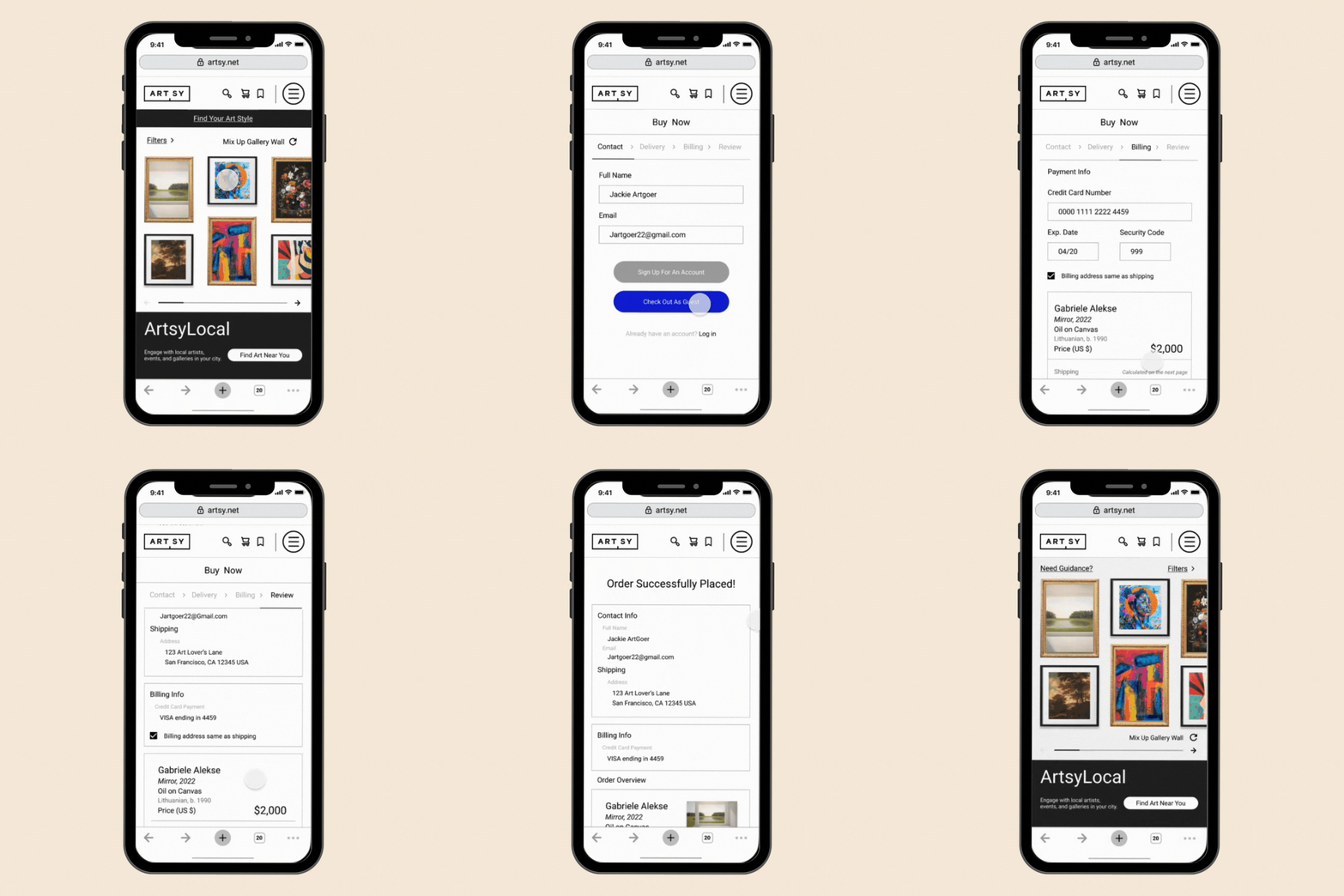
Shop with ease using the new ”add to cart” and guest checkout options for your convenience.
Connect to the art community around you with a new and improved local guide to all that is trending in your city.
Here is how it all happened.
The user-first approach we took began with trying to discover and understand who our users were in the first place.
My team collectively asked around for any art enthusiasts within our own personal and professional networks in order to compile two groups for user interviews and initial usability testing. Focusing on those who were already familiar with Artsy, we tried to include all creative perspectives to gain a variety of insights.
We were able to interview 4 art lovers via Zoom. This included experts and novice enthusiasts alike. During the 20-25 minute interviews, they were asked to tell us about their latest experience buying art and the varying emotions throughout the process.
Some questions asked were;
What/where is your preferred place to meet your art & design goals/needs?
How do you determine what kind of artwork/design you’re interested in?
How often do you browse artwork/design on your phone and how was that experience?
After picking apart this data using affinity mapping, here’s what we learned…
-

Local
Buying local helped users feel pride and connection to their art.
-

Connections
Supporting artists by keeping up with them further fostered that connection.
-

Inspiration
Browsing on social media was the most common way for users to find art inspiration.
-

Budget
Price was one of the most important variables and transparency is absolutely necessary.
-

Simplicity
Simplifying the art buying process was the key to helping users commit.
Now that we have an understanding of what makes or breaks a good experience for our users, the next step was to see how Artsy measured up.
The 5 participants for the usability testing were asked to perform a series of tasks on the existing Artsy.net mobile site. We recorded their screens and their reactions via Zoom to add to our data set. This first-hand observation was vital to gaining a well-rounded concept of our users and their experiences with Artsy as is. Our findings were all recorded using qualitative data like verbal in-test feedback and a quantitative satisfaction survey post-test.
On a scale of 1-10, with 1 being least satisfied, 80% of users rated their satisfaction with Artsy’s current site at a 7 or above.
Overall Satisfaction
Ease of Use
When asked how easy tasks were to complete on a scale of 1-10, 1 being very easy, 60% of users rated the task of finding a new artist at a 3 or above. The same number of users also found the task of finding an event near them less than easy with a rating of 4 or above on the same scale.
However, we also noticed some areas of confusion…
The overall interface proved to be intuitive enough for users to begin their journey however the following items pointed out possible roadblocks in a user’s path:
Art terminology can be intimidating for someone new to the art world and needing to differentiate between a fair, show, gallery…etc is a deterrent to someone simply looking for art events near them.
Terminology
Intimidation
This feeling of intimidation extends into the filter categories as insights showed that the existing options were hard to understand and prioritize. User’s weren’t able to narrow down their results as easily as they preferred.
Caused by the ever present need to log in for the full Artsy experience including seeing pricing on some items. When prompted to log in or create an account, users preferred to navigate away or abandon the task altogether.
Friction
Comparing
We finalized our assessment of Artsy’s current experience by using competitive and comparative analysis to connect any recurring themes in our data with what was offered by the competition. Our group split up to each tackle different aspects of Artsy’s experience - learn/discover, share, buy, and sell. I honed in on the Metropolitan Museum of Art for insight into how a less likely competitor might allow for the optimal art discovery experience. My teammates gathered further insight on sites such as Christies which is known for it’s auctions and Saatchiart along with Minted which are popular art and decor marketplaces.
This is where we began noticing these areas of opportunity across our data set. The themes that emerged were related to transparency in the buying process, fostering connections within the community, and allowing users to explore without any friction.
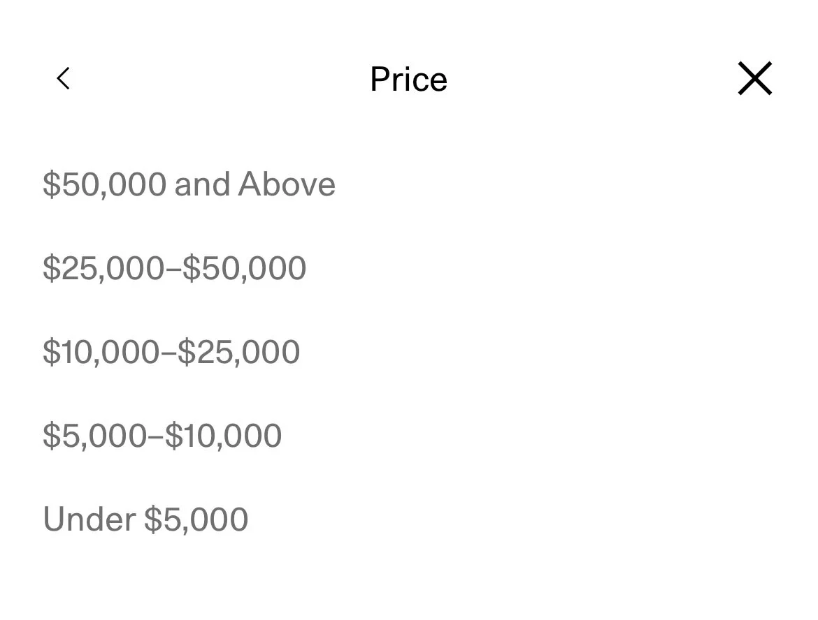
Artsy’s current website lacked an adequate price filtering option for those on a budget of less than $5,000 and didn’t currently allow users to sort results by price either. We realized how important these things were from our user interviews with the younger demographic being deterred when the numbers aren’t immediately and easily available throughout the whole experience. That is further reinforced with a shopping cart to keep everything all in one place which Artsy.net was also missing compared to competitors.
Artsy.net - mobile website
*Now we understood this option wouldn’t apply to all pieces, some of which require special handling but along with attracting younger users, we imagined this to be the first step to appealing to their needs as well. Needs like affordability and accessibility for a more centralized buying process. Being able to easily keep track of their decisions while browsing certainly aids in this while adding a layer of confidence for users about their experience.
A majority of the competition also had features to easily facilitate artist-to-consumer connections which our users found valuable. Things like being able to follow artists and finding nearby events were important for creating that bridge between the art and the audience.
Artsy currently has features allowing their users who have accounts to follow artists directly on their platform but lacked the option for users to take it a step further by linking to the artists’ social accounts as well. A key insight that users shared during the initial interviews were their frequent tendency to use social media to get real-time updates from the artists they like, where their next event would be, and even what inspires them in everyday life. Things that have become paramount to consuming art in the digital age.
Lastly, the opportunity for exploration was preferred by users without the added friction of having to log in to see a price or access certain features. Guest access needed to be expanded to encourage the discovery of Artsy’s services.
Thinking Critically
Our art consumers needed a better way to engage with artists they like and feel a connection to their local art community, all while finding art within their budgets so that they can make meaningful and fulfilling art purchases.
Who are our art consumers?
-
Come back soon to view and download Jackie’s full persona profile and user journey map!
Jackie is in the heart of our new target demographic being a recent graduate with a newly found interest in the arts that they want to cultivate all within their budget.
Gordon is a veteran art lover who has a good eye for quality. His interest in Artsy focuses on using it to build his art portfolio and ensure a return on his creative investments.
-
Come back soon to view and download Gordon’s full persona profile and user journey map!
We knew we needed to put Jackie’s needs at the forefront without causing any unnecessary friction for Gordon’s goals as well.
We began asking ourselves, how might we…
…make the pricing options more inclusive?
…help users easily purchase art?
…help users easily find local art events and galleries?
…allow guests to easily navigate the site to achieve their goals?
…connect users to what they’re specifically looking for?
Bright Ideas
Through a live group ideation workshop, we took off brainstorming ideas. Within minutes of a few rounds of rapid fire sketching, we drafted various concepts including personalizing a user’s experience through customized journeys, allowing users to shop curated collections based on trending categories and ultimately settling on the idea of attracting newcomers with a fun and practical art style quiz.
We chose this concept over others because it allowed for a seamless transition into the existing interface while still allowing for multiple possible pathways to discovery.
*Artsy’s “The Art Genome Project” is at the forefront of this concept. This is the existing classification system and technological framework that powers Artsy. Using over 1,000 characteristics (genes) to map connections between artists, artworks and other design objects across the world and throughout history. Via related tags of artworks chosen in our new quizzing process, users would then continue to be led down a path towards success in finding their ideal piece.
However this is not the only task we intended to tackle.
Taking it a step further included revisiting some existing features to better support the new influx of users while making the process enjoyable and memorable. We did this by honing in on the pricing visibility and rebuilding a homepage better suited for encouraging art discovery and inspiration.
Checking Out
I continued on independently to approach the checkout process with a new user journey in mind.
One that now included adding items to a virtual shopping cart all while still integrating the existing elements needed when taking extra care with specialty pieces.
This looked like developing a cart overview page that afforded users the ability to see even more related pieces or add a frame for their artwork before checking out. Alongside this, a “guest” checkout option was also incorporated.
Homepage Revamp
A few fellow teammates joined together to collaborate on a new interactive gallery wall feature for the homepage. This feature stems from a human-centered idea to connect the art to the tangible constraints of a user’s home by displaying the pieces as if they are hung up on a wall in a frame.
We collectively believed adding this element would continue to forward our concepts of accessibility by allowing users to begin their visualization process in the most natural and effortless way.
From this gallery wall, users are able to select pieces that interest them and continue on to view artist or gallery information such as links to their socials and full artist profiles.
The New Artsy
After developing our ideas in Figma, we deemed our mid-fidelity prototype ready to be put to the test! We conducted our second round of virtual usability testing, now on the new Artsy through Maze.co. Testing on tasks relating directly to finding a specific piece of interest through the many options to curate results and finding the connections users were seeking, we had the goal of ensuring we were successfully bridging that gap between our new target users and our loyal, existing ones. From our 14 participants, Here are the key insights…
-

Exploration & Discovery
A majority of users found that the new design allowed for more exploratory opportunities to find artwork that was interesting to them. The home screen gallery wall feature was something that users revisited to explore more.
A 45.5% indirect success of the first task meant that users took the time to look around when first introduced to the interface.
-

Navigation
Heat maps showed that users relied on the hamburger menu to navigate the website more than we anticipated when looking for elements needed to complete their tasks. The way in which information was organized within the menu, in combination with not having key buttons linked in the prototype was not intuitive to users.
-

"Need Guidance"
Users felt as though the wording of the “Need Guidance?” was unclear; Users did not realize this button would take them to a style quiz to personalize their feed with 53.8% of them diverging off of the ideal path while they struggled to find the right one.
What We Changed
At this point, our group diverged once more with my goal being to create a card sorting workshop in order to gain insight into how users categorize and prioritize their search results and filtering options when buying art. Based on the results from 8 participants, this is how it stacked up...
My teammates set off to address the disconnection with our “Need Guidance?” terminology for the art style quiz.
Short on time, we decided what better way to do this than taking a vote! With three new options listed, we began taking tally as a group and decided to take it a step further by allowing our UX design cohort to join in on the fun, asking which catchy phrase was the most intuitive for a personalized style quiz.
“Find Your Art Style” won by a landslide.
Other options were:
“Help Us Personalize Your Feed”
“Explore Your Taste Quiz”
High Fidelity
Nearing the end of our stint, I took the lead in putting together our final presentation with the help of another teammate specializing in copywriting. The rest of our fellow teammates took to implementing these changes into our final high fidelity prototype.
In Conclusion
A user-first approach was the key to the start of our in-depth analysis. We set out with the goal of discovering the best way to bridge the gap between Artsy’s users of then and the users of now to further promote the purpose of this company. Artsy.net is the world’s leading art and design marketplace and its purpose is to achieve an all-in-one fine art experience for all which continues to bring global creativity right to your fingertips. Through thoughtful additions and revisions aimed at bringing crucial user needs such as accessibility, affordability, and connection to the forefront of our designs, we believe we have begun to successfully solve these problems.
However, this is only the tip of the iceberg…
What’s Next?

Thank you for viewing.
If you’d like to know more, please check out the “about” section for contact details.


